Journal · November 7, 2026
Accessibility we measure
We photographed the whole app in three languages and two themes, and found over 2,000 low-contrast texts. Here’s what changed.
Accessibility can’t depend on someone remembering to check. So it became measurement, on every version.
- On the site: every page goes through automated tests before going live, and Lighthouse gives it 100 for accessibility. You can now pick the text size (A−, A, A+) and high contrast in the footer of any page; high contrast turns on by itself when your system asks for more contrast.
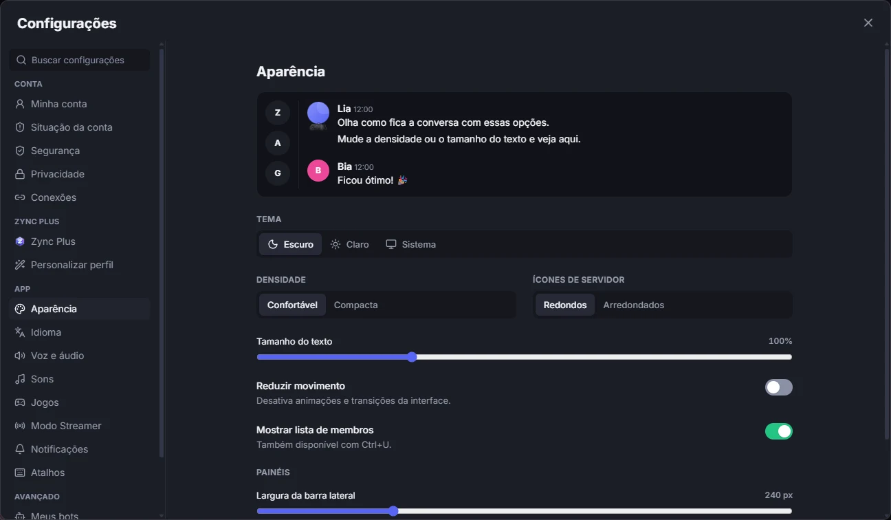
- In the app: we photographed 41 screens in Portuguese, English and Spanish, in light and dark themes, and checked the contrast of every text. Secondary text was around 3.4:1, below the recommended 4.5:1, in over 2,000 places. The colors were fixed in Zync 0.38.0.
- On the phone: there’s high contrast in You → Appearance, which can follow Android’s "High contrast text".
High contrast in the desktop app and captions in voice are still missing. The list of what’s missing is on the Accessibility page, and anyone who runs into a barrier can write to us.